SaSR Logo Refresh
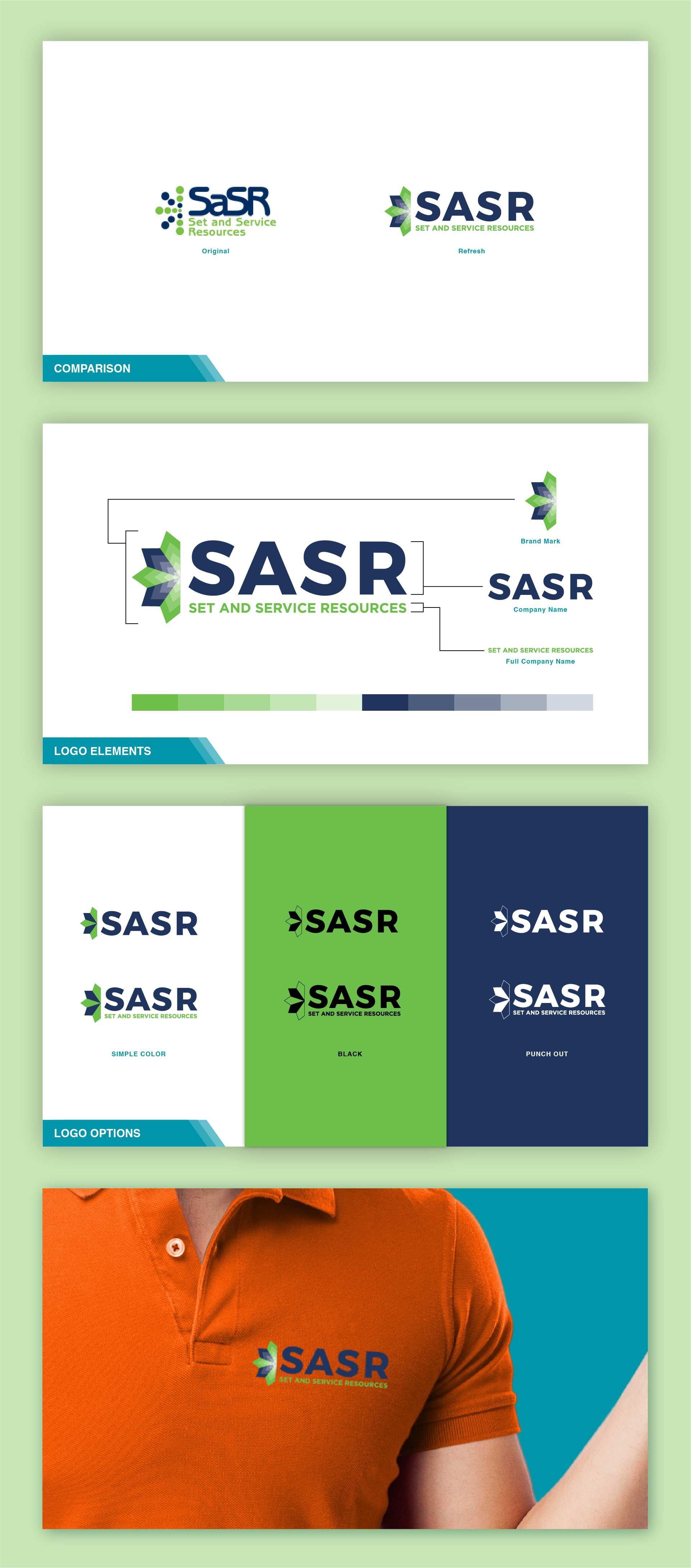
Set and Service Resources or SaSR was looking to refresh there brand to something would make them appear more trust worthy in a modern world. They had interest in refreshing their entire look but wanted to start with the logo first.
We chose to move away from the round aesthetic in their existing logo and move them towards something used hard corners and held a firmer presence. The burst on the left was reworked from a dot design to a stacked set of diamond shapes and the lettering was updated to a bold san serif font over the playfulness of the original rounded letters. The biggest key with this change was the end result need to maintain a familiarity while still gaining modernness.
Deliverables: Vector Logo
Tools: Illustrator